With Self-Publishing becoming more popular AND profitable, authors are taking on the responsibilities traditional publishers normally would.
One of these responsibilities is the book cover.
I don't need to go into the details of why its important to have an eye catching cover, but in short, if you don't have a good cover, then you won't sell books, or make money, and then you will see your book cover on one of those book cover blooper sites, and you will be sad.
(How do you like that run on sentence? I talk in run on sentences too.)
I did a study to find out why authors without professional covers choose not to get a professional artist.
Here are the top three reasons why:
1. Money.
It cost money to get a good cover, but you can find a good graphic artist to use stocks. These covers can be as low as $75. Though some covers can run into the thousands of dollars to produce.
2. They don't know where to get a cover.
Ask your other author friends with great covers or check out www.EdenLiterary.com
3. They have a relative who is an "artist."
The cutest ones are the covers done by the author's nine-year-old kid.
I want to show you a few covers (with the authors' permission of course.)
Take a look at Karen's book:
Notice the lighting and blending.


Before touch ups After touch ups
- Lighting can create the mood for the book.
- You also want to make sure when using multiple stock images that the lighting all comes from the same direction.
- Make the skin a shade darker. Of you don't, it will make the person look washed out once printed.
- Put light in the eyes.
Cheri's book:
.jpg) |
| Stock 1 |
.jpg) |
| Stock 2 |
 |
| Stock 3 |

- Layering your stocks can give you a completely new and unique look.
Theresa's book:

Here is an example of how you can make the same stock art look different - different enough to express genera or hit a complete new target market audience.
- Its like magic. You can change so much. Get creative. The possibilities are endless.
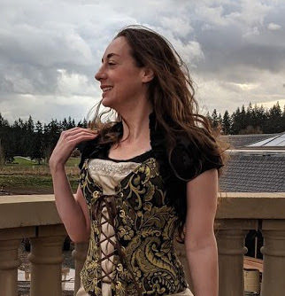
Tina's Book:


The author was really involved with this one. She took the stock art photos. The model is her beautiful daughter. The author also painted the girl's shirt!
A few ideas to think about when you work on your own cover.
A few ideas to think about when you work on your own cover.
- Watch the skin coloring! In the original, because of the lighting or the way the image digitized, the model turned out looking a little yellow.
- Color treatments (both pictures) made the colors more vivid and less muddy.
- You need balance in pattern. We have two graphics. The one on the bottom is super busy with all the buildings so I countered this with the calm sky on the top.
- Balance in color. Not all books need balance with color, especially if you are going monotone or trying to make a focus point. With this book, the balanced colors are red, green, and blue.
- I used different embellishments that were super customized for this book. (rose, border, etc.) This is a fun way to make your cover art your own. Just don't over do it with embellishments.
- I pointed the model facing the opening of the book. Rotating, mirroring, and sizing images can make a huge difference.
- Use only portions of stock art. (Explained more on The Tyrant King cover.) The sky on the this one belongs to the same stock as Marsha Ward's cover below! No one would ever know unless I pointed it out.
Oh, here is this too:
.jpg)
Yep, I made that whole bar with just this.
Marsha's Cover:
Before:

After:

Totally squeeing on this one. We decided to make this one a wrap around cover instead of using panels. Wrap arounds (especially one like this) can be much more expensive because its a lot more work.
Take a look at the original. - Notice how the picture isn't long enough.
What I did was position the main figure then spliced the background and air brushed them together to make a seamless painting. Go ahead - blow the cover up on your screen and look at it magnified. I bet you can't tell the background image is really 12 panels glued together with paint.
- If you have a historical book, pay attention to details in the stock that need to be eliminated such as powerlines, telephone poles, tire tracks, small airplanes in the sky, details on clothing, etc.
Cheri's Book:
Air Brushing


You can make anything look and be something completely different with air brushing.
Air brushing is basically like a fine mist painting. Its like using a can of spray paint, but more exact and this can be done on the computer in a professional program like Photoshop.

- Make your spine STRONG! This is actually a wrap around. The middle is a bit transparent so the title of the book will stand out. Truth is, most books in books stores don't get cover facing out. It just takes up too much room.
- Dressing up your font doesn't mean make the lettering so fancy that you can read it in a fast glace. Try using embossing, highlighting, drop shadows, and other affects that will give your cover a polished and professional look.
- If you already have great cover art, consider hiring someone to do you lettering placement. A sloppy lettering job is the first sign that the book is self published, and not in a good way.
Bleeds
If you plan to do a print you will need to have a bleed.
Your printed book needs to be cut to the right size.
The printers try to be exact, but they will need some wiggle room.
Here is a visual:

- Make sure your spine is straight and in the exact middle.
- Don't put words, important graphics, or font to close to the edge.
Another Cheri Book: (She is amazing)


.jpg)
The leather is a picture I took for this job. Same with the dagger and the table.
I had a hard time finding a crown I liked. The stock I found is something that wouldn't work as a whole, but one part became an awesome focal point to the cover.
- Look at pieces of stock to create a whole new picture.
Debbie's Book:


Here is another look at customizing and layering.
Look at the locket details. Its engraved now and has a few other fun details. The lighting on the locket has also been changed to match the background.
So, my author friends, don't settle on a less-than-awesome cover. You can have a super awesome cover of your dreams. No excuses. You've worked so hard on your book, you might as well wrap it up in something nice when you present it to the world.
Thank you AWESOME authors for letting me show off your books.
Here is where you can purchase their books:
Karen: http://karen-hoover.
Cheri: http://www.cheri-chesley.com/ AND
http://www.amazon.com/Cheri-Chesley/e/B004J1QOSS/ref=sr_ntt_srch_lnk_1?qid=1427931654&sr=1-1
Theresa: http://www.amazon.com/Destiny-
Tina: http://amzn.com/B00R3MHREK
Marsha: http://amzn.com/B00A4F5G2S
Debbie: http://amzn.com/1480076201
Thank you to ShutterStock for the stock images.


This is very informative. Thanks.
ReplyDelete